
Starting your own Shopify store is a big step. Not only are you likely figuring out the logistics of selling your own product, you also have to learn other new skills in order to best market your product. Setting up an attractive, high-converting store is a skill, but new merchants often don’t have the budget or resources to hire a professional to assist them with that first step.
In this article, we will walk through some of the basics of how to set up a professional-looking Shopify store. If you’ve ever wondered ‘How come my store doesn’t look as good as the theme demo stores?’, this guide is for you!
Photography
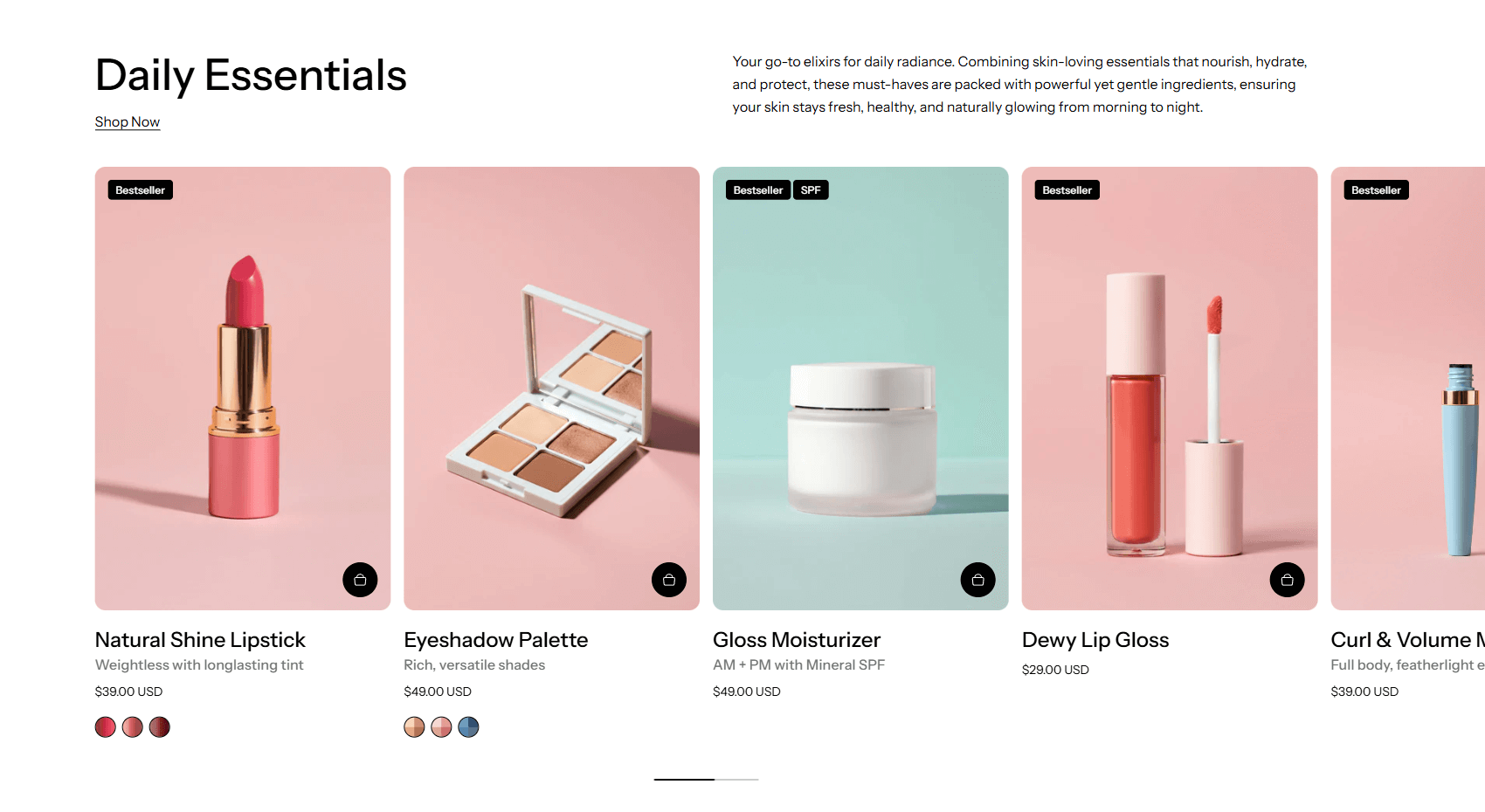
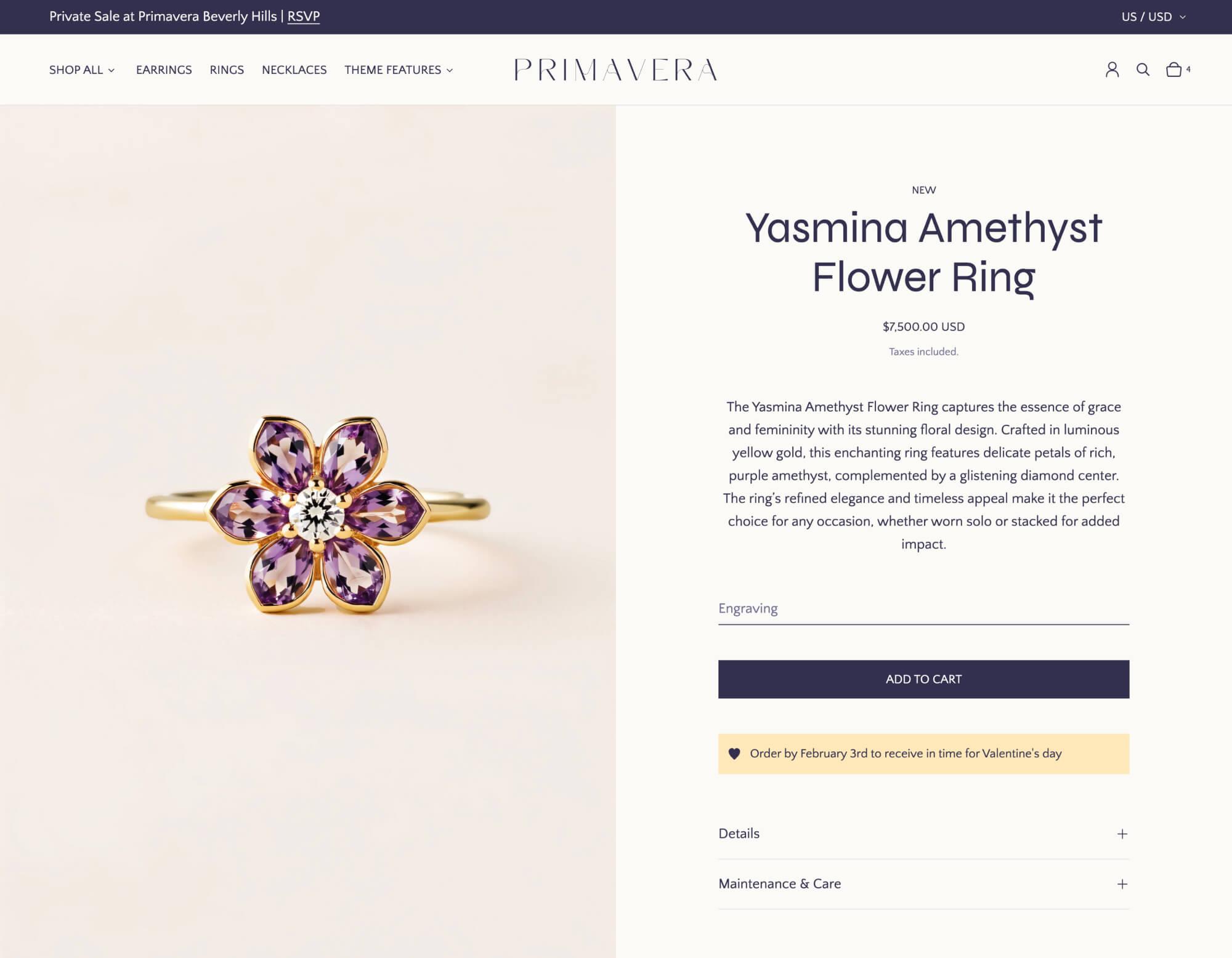
Photography is the primary way to communicate information about your product to your customers. You can have the best copy in the world, but if you don’t have any visuals, it’s unlikely that you will get any sales. If there is one thing we suggest a new merchant investing some money into, it’s photography. You should invest in photography because ultimately, it’s the glue that holds your website and brand together. Research your competitors and aim to match or surpass their level of polish.
Do I need to hire a professional photographer to make my store look good?
With good photography being so critical, is it necessary to hire a professional? Not necessarily! Although hiring a good photographer will likely deliver the best results, it is possible to achieve decent photography with your smartphone.
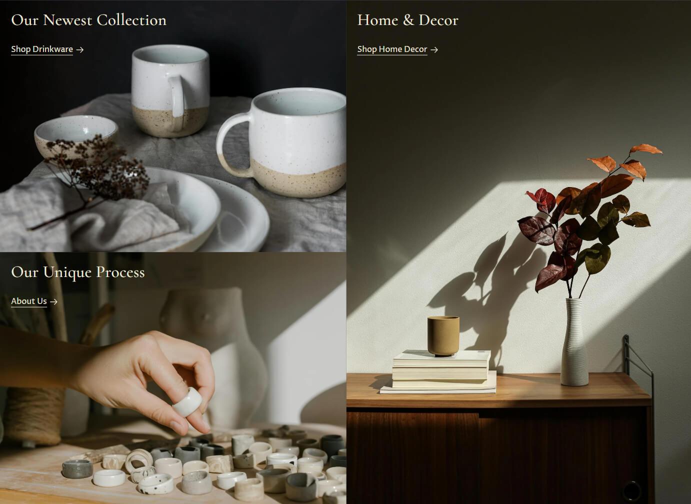
One important, yet neglected, aspect of brand photography is consistency. It’s worth taking the time to develop your brand look before you start to shoot any photos. Will your product photos have a warm, cool or neutral tone? Will they be on a white or colored background or feature any additional props? All these are questions you can ask yourself before you get started.
Don’t be afraid to look at inspiration photos! Gather up a mood board of photos you like, this can help shape the overall direction. Once you’ve landed on an overall vision, you can consider investing in the things you might need to be able to consistently replicate the look you’re going for, such as particular lighting equipment or props.
Having product shots that feel cohesive adds professionalism to any store, as it creates a more unified browsing experience where customers can focus on the differences between your products without adding cognitive load. Lifestyle images have a bit more flexibility – it’s not uncommon for certain industries such as fashion to adopt a completely different photography aesthetic for every new campaign.
If you’re just getting started, work on getting the highest resolution images you can with neutral lighting. With the post-processing tools available, it is much easier to add a background to a simple shot than it is to remove a complex background.
Can I use stock images?
Stock images can help to create a certain feel for your store without requiring a ton of investment. Sites like Pexels, Unsplash, etc. provide excellent photos for a reasonable cost, or no cost at all.
However, since stock photos do not actually contain your product, make sure you choose photos carefully, and avoid photos that feel like obvious stock photos. In order to build trust and create long-term relationships with your customers, try to use real images of your product wherever possible.
Can I use AI-generated images?
AI image generation tools have opened new possibilities for merchants on a budget. These tools can create unique product lifestyle shots, brand imagery, and backgrounds that would otherwise require expensive photo shoots.
When using AI-generated images:
- Consider AI imagery as a compliment, not a replacement, for real photography to maintain trust levels
- Focus on lifestyle and brand imagery rather than product shots
- Maintain consistency by using the same prompts, styles, and settings across your image generation
- Consider using AI to enhance or extend existing product photos with new backgrounds
- Disclose when using AI-generated content if required by your local regulations
- Run AI images through the same optimization tools (TinyPNG, etc.) as regular photos
AI generation works particularly well for creating seasonal campaigns, hero banners, and atmospheric brand content without the cost of traditional photography.
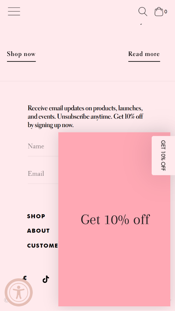
Colors
Colors can evoke strong feelings in viewers without the need for words. There’s no singular right approach to colors, but we’ve often noticed that newer merchants often tend to pick too many colors, resulting in a site that can feel chaotic or overwhelming. When in doubt, lean towards a pared-back color palette, and let your imagery bring the colors instead.
How do I pick colors for my store?
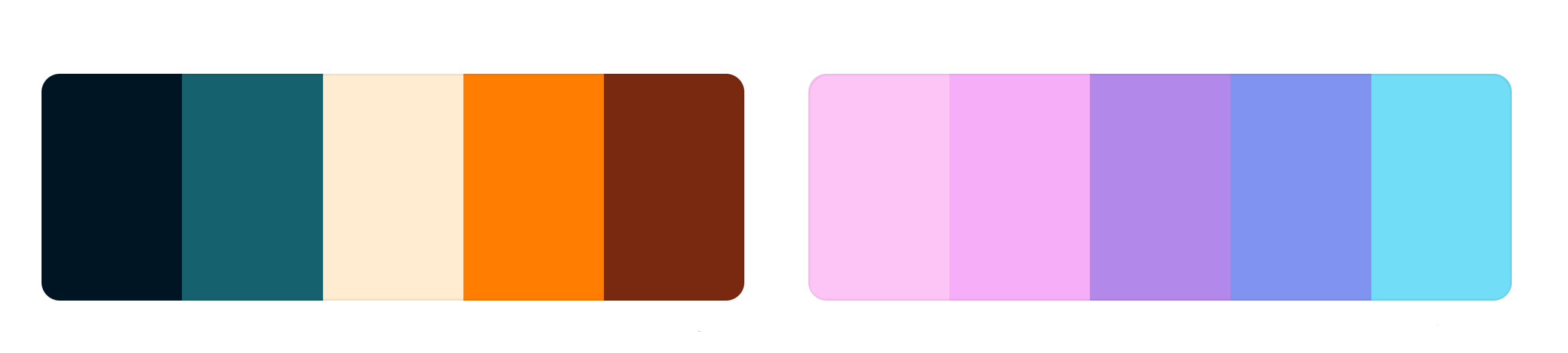
A standard approach is to pick a set of neutral colors, then add one or two accent colors in order to round out the palette. Analogous colors can create a sense of harmony and calmness, whereas complementary colors will give more striking and bold impression. Both can be appropriate depending on the brand, so try a few color palettes out and see which one sticks!
Image quality
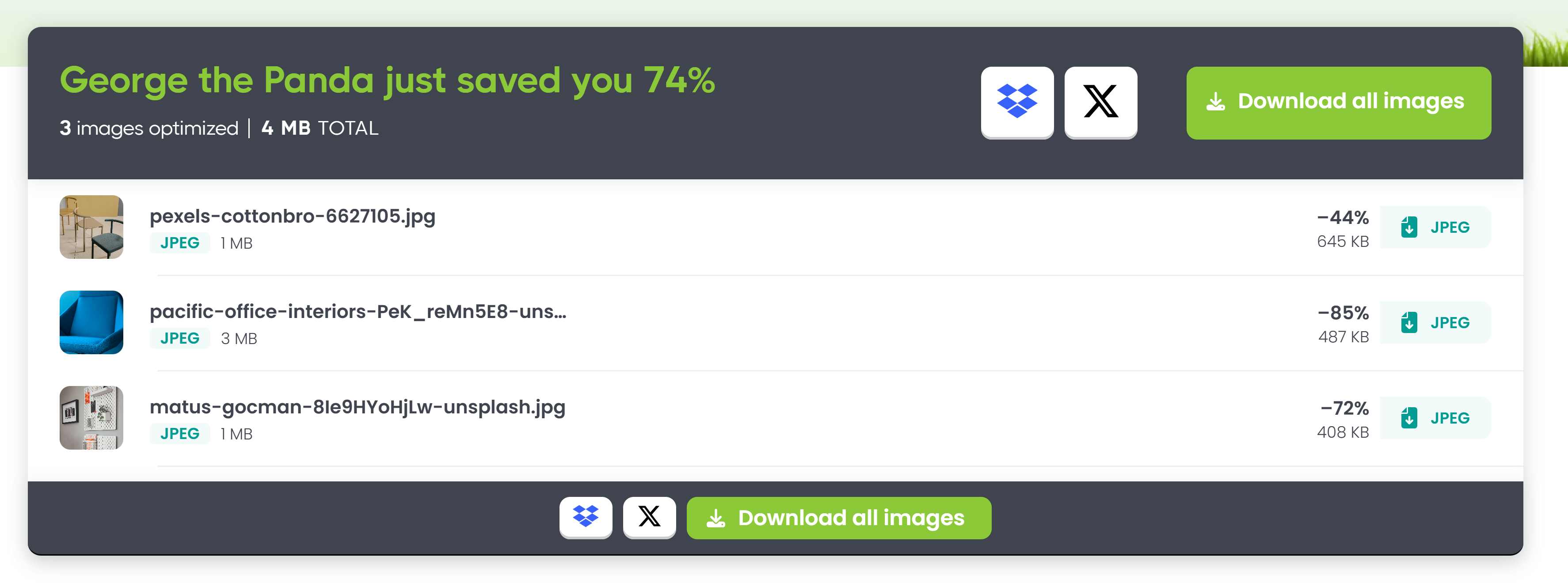
An often under-looked aspect of visual presentation is the image file format. Even the most striking photograph can leave a bad impression if it’s delivered in the wrong format. A good image experience should be seamless; blurry images detract from your products and overly high-quality images may test your users’ patience if they take too long to load.
Although Shopify automatically processes images on their end, we’ve seen a substantial decrease in file sizes by doing processing work before you upload the image to Shopify. By choosing the right file size and compressing images, the file size can be up to 40% smaller than if you left it to Shopify to compress.
What file format should I use for my product images?
Choosing the right image format is essential. For photography, including lifestyle and product photography, we recommend using a next generation file format like WebP if it is available to you. Most graphics software should allow you to export WebP natively, you can even run it as a batch process to save time.
If you can’t export in WebP, try using a JPEG instead. Being a traditional file format, JPEGs support nearly all devices at the expense of some quality. Whether you use WebP or JPEG, we suggest you run your image through an image compression tool such as Tinify/TinyPNG or Squoosh. Despite it’s name, TinyPNG can handle a variety of raster-based image formats, and is available as a plugin for a variety of plugins as well as an API and a desktop app. Squoosh is a speedy, local first tool that allows you to really finetune the quality settings with a visual editor.
What file format should I use for icons and logos?

Aside from photographic images, e-commerce sites often need to include logos, icons or kind of illustrated imagery. This kind of imagery is often created in graphic illustration software such as Adobe Illustrator. Though these tools allow you to export in many different kinds of file format, the optimal way to export it is to use a vector-based file format in order to preserve a graphic’s crispness at any screen size. The only vector-based file format that has wide browser support is SVGs, so you’ll want to ensure that all of these graphics are using the SVG file format. If you use a raster-based format for your logo, such as a JPEG, you risk having it appear blurry in certain contexts.
SVGs can be further processed by running them through svgomg for the best results. It’s not uncommon to notice a 30-40% decrease in file sizes by running your files through a tool like this, so it’s well worth the effort!
One final reason to use SVGs is that they can be edited without any loss of quality, even without the source files. If you ever need to create an alternate color version of your logo, this can be done quickly without any loss of visual quality.
Design
Many new merchants try to pack everything into a small space, believing that it’s necessary to pack all the information about a product above the fold. In reality, prioritizing content ‘above the fold’ is less about information density, and more about information priority; too much information can easily overwhelm and detract from the overall brand experience.
Instead of thinking about how much content you can add above the fold, think about what information is the most important to communicate immediately. With things like offers, animations and marquees, there’s definitely a point of diminishing returns where adding extra elements can actually harm your conversion.
If there is a lot of product information to communicate, use secondary sections below the fold. Users scroll when the content is valuable or signals that more is to come, so don’t hesitate to distribute the information into different sections and present it in a visually engaging way. Leverage individual product templates or metafields/metaobjects to create product-specific content within a single template. If the information is especially important, add links to the secondary content above the fold.
How much whitespace should I use in my design?
When considering spacing across your store design, use whitespace to group related elements. As a general rule of thumb, spacing around different sections should be larger than spacing in between different elements within a section. This will create a natural hierarchy and grouping that guides the eye throughout your design.
How do I design a good e-commerce experience for mobile?
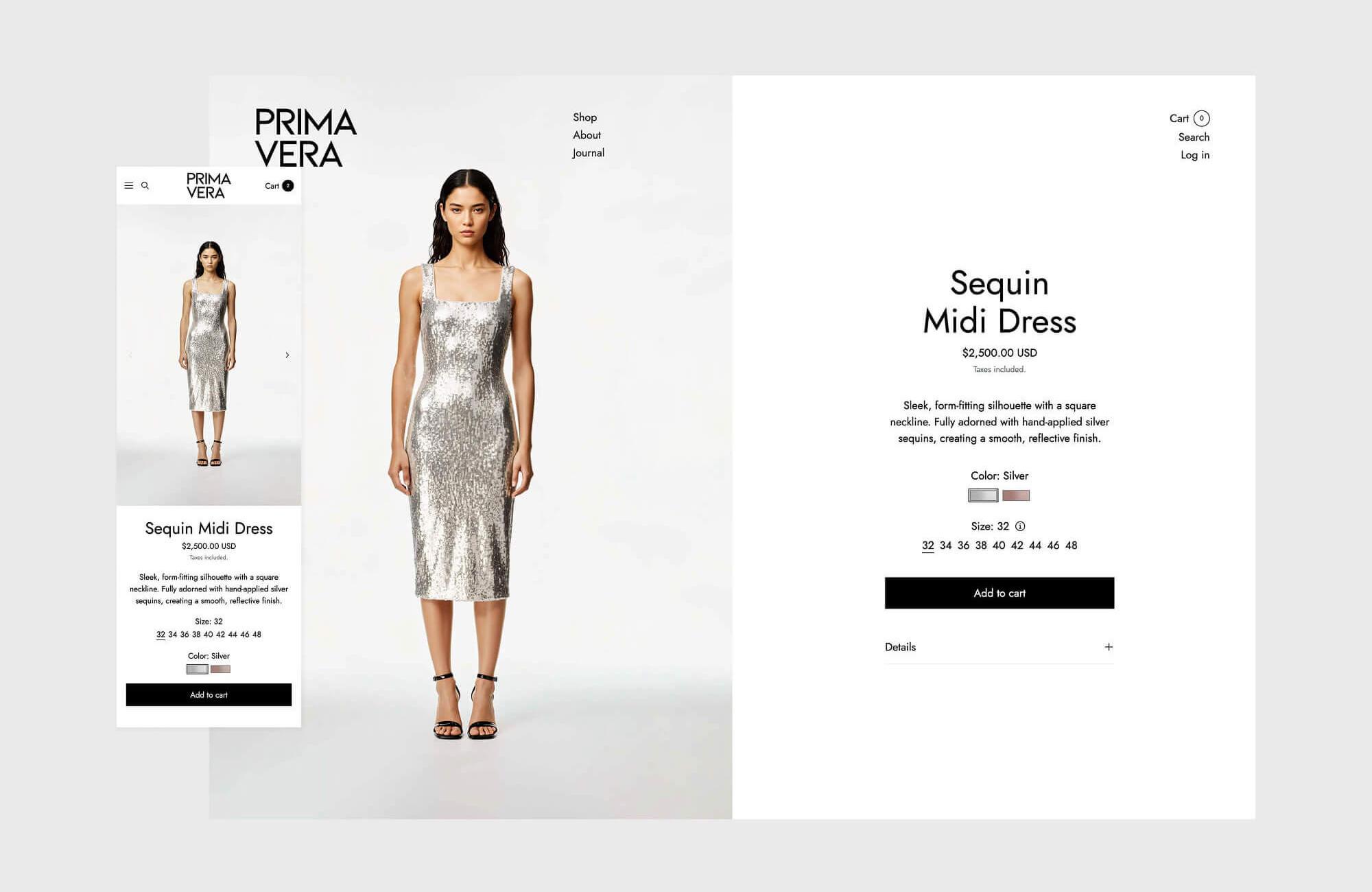
For many industries, mobile users make up 50% - 80% of their total online traffic. Despite this, the majority of design work still focuses on the desktop experience, and many merchants never even look at their store in mobile mode.
If there is one thing to take away from this guide, it is that merchants should be paying special attention to the mobile experience. Use mobile-specific imagery if necessary; a good Shopify theme will let you choose different images for desktop and mobile, and give you tools to control the height specifically for mobile. Make sure that your content still makes sense when stacked in columns, and no sections are out of order. Be wary of using too many floating elements! While there may be space for a loyalty program, a floating social share bar, a sticky add to cart and a chat widget on desktop, they tend to take up too much valuable screen space on mobile. If they are critical for your business, integrate them into your site flow.
Navigation
It’s common for merchants to overload their navigation with top-level links, believing that if they add an extra click, it would cost them sales. However, the cognitive load of wading through a dozen top level link can actually pose more of an obstacle than adding an extra click
What should I put in my header menu?
We recommend taking a more structured approach, utilizing fewer top level links and then leveraging features such as megamenus in order to provide hierarchy to your sub-links. For example, a fashion store may have two top-level links for shopping, ie. ‘Shop Men’ and ‘Shop Women.’ By grouping your menus logically, you can reduce cognitive load and create a more streamlined experience. Many megamenus even support the ability to add image links, allowing you to promote key items with eye-catching visuals.
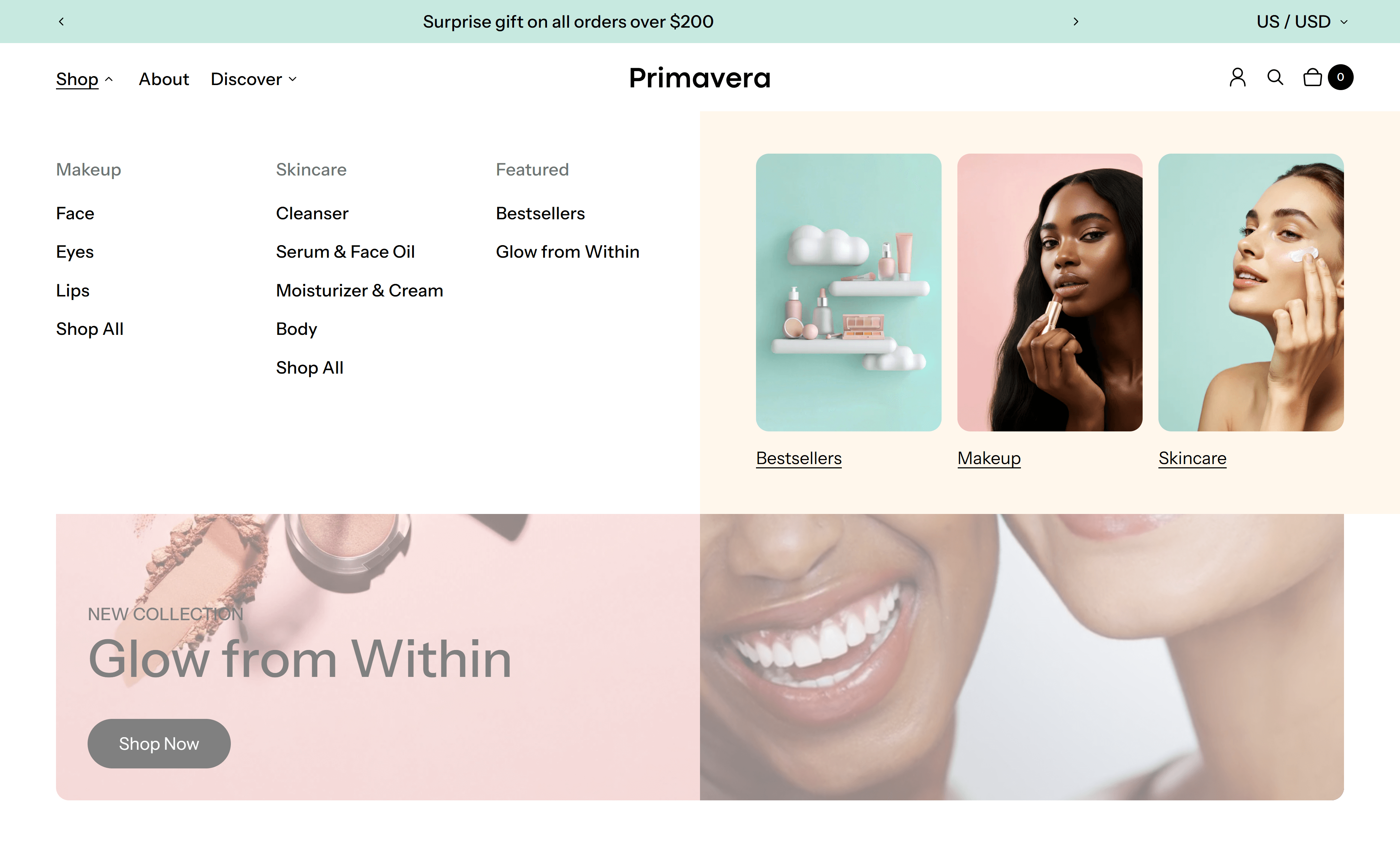
Resist the temptation to add many support/brand-related links to the top-level menu. Either utilize megamenus or dropdowns, or add it to a different region such as a secondary menu or the footer. This will keep the customer journeys more focused. Remember, customers who are seeking out support have a greater dedication to the task than users who have not yet purchased from you.
Copy
Many first-time merchants undervalue the role of copy, often conflating their personal voice with the voice of the brand. Take a step back and think about what kind of tone of voice you want to convey to your customers, and make it consistent with your brand goals and values. For example, while a brand targeted at younger consumers may find it appropriate to use many exclamation marks and emojis, a similar tone of voice may alienate customers from a luxury brand.
Once you’ve established the overall tone and messaging, take time to refine your copy. Identify the key things your customer needs to know about your product, and try to strike the delicate balance between providing enough information without overwhelming the viewer. Eliminate unnecessary marketing speak, such as overusing hyperbolic descriptions or relying on vague, wishy-washy language that lacks clarity, and be sure to run a grammar and spelling check on your copy.
Theme
Take some time to explore the features of your Shopify theme! Even if you’ve already made a decision about your theme, finding the time to play with the various settings and sections of your theme can unlock many creative possibilities. Many themes have many additional features and functionality that you might not even know about, potentially eliminating the need for third-party apps. Spending a higher upfront sum on a theme with some advanced features may save you money compared to purchasing individual apps or sections on a monthly basis.
Theme support can also help you set up advanced features free of charge, without the need to hire an external developer. Stand out from others using the same template by customizing your sections and store to fit your particular brand needs.
Conclusion
Creating a professional-looking Shopify store without a designer is entirely achievable with the right approach and attention to detail. By focusing on the fundamentals we’ve covered – consistent photography, thoughtful color choices, optimized images, clean design, intuitive navigation, and compelling copy – you can build a store that rivals those created by professionals.
Remember that building a great-looking store is an iterative process. Start with the basics: ensure your product photos are high-quality and consistent and maintain a clean, uncluttered design. As you grow more comfortable and learn from your data and your customers, you can experiment with more advanced features available within your theme or the Shopify app ecosystem.
Most importantly, always view your store through your customers’ eyes. Regularly test your site on different devices, ask friends or family for honest feedback, and don’t be afraid to make adjustments based on what you learn. Your store doesn’t need to be perfect from day one – it just needs to be trustworthy, easy to navigate, and showcase your products effectively.
With these guidelines and a willingness to learn, you’re well on your way to creating a Shopify store that not only looks professional but converts visitors into loyal customers!

